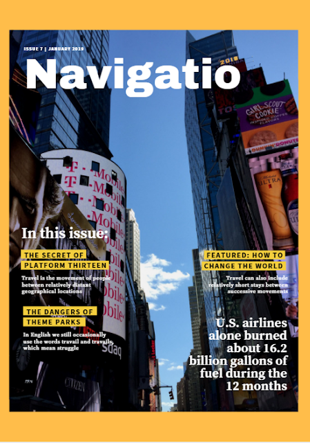
Also, I think I've been playing around with the different colors of borders on Canva and I didn't really like any of the colors while I was trying them. Green seemed too playful, blue blends in too much with my cover image, and yellow is always a yellNO in my books. However, when I came to find the orange border, I thought it was perfect. To me, it seemed playful, but still had a warm vibe that still gave off the level of substance that I'm looking for. In addition, the border fits in with the cover image, giving the magazine cover an aesthetic vibe that I really want to harness.
It's halfway finished and I hope to finish the rest of the cover after I finish my table of contents so that I can place the secondary cover lines and the main cover lines into their right spots. Then, I can rearrange the current subheading tiles and rearrange them so that they are in the format I want them to be. I will also have to move the sell-line to the bottom of the cover page (or I might leave it slightly above the title if it doesn't look as aesthetic as I want it to look.)

No comments:
Post a Comment